Two Column Layout
 Admittedly there are a few problems with this. When you resize the window below a certain size columns will jump into the left hand side of the screen. Not entirely like a table. Also the % widths cannot add up totally to 100%. I don't really understand why.
Also, please note that in this two column layout, you can only have one nav column plus the middle column on a page. If you have all three, the layout breaks. If you want both a left and right hand side nav column layout (i.e. a three column layout), you need to change the % widths to something like 25%, 40% and 25% respectively.
Table Layout Substitute
Finally, here's some CSS to use to replace tables when you've used them for things like laying out froms:
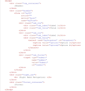
 and here's an example of the 2 column layout plus the table substitute in use:
 Again, there are a few problems, mainly around the content sometimes spilling when the windows are tool small but it works pretty well.
If you doubt this works, here are some screenshots of it on Firefox 2.0.0.6, IE 6.0 and Safari (all on Windows XP).


No comments:
Post a Comment